Alike WA x Brand Name & Visual Identity
It’s through what is shared that we find comfort in connection
At the heart of every thriving community is a network of individuals who share lived experiences, offering each other comfort, guidance, and strength.
For years, ConnectGroups has been a hub for those seeking real-life connections, empowering individuals through peer support. The next stage of its journey will see it continue working towards its vision, evolving and growing to empower new groups, younger generations, and new models of peer support.
The organisation understands that no experience is the same, but it’s through what is shared, what is alike, that we find comfort in connection. Today, the organisation takes a step further, with a new name that encapsulates our vision and purpose, pairing our respect for the past with our aspirations for the future.
We are proud to introduce, Alike—a name that reflects the unity, support, and shared experiences that bind us all. With Alike, we continue to help people connect, thrive, and build healthier communities together.
Approach
Naming brands is hard. Renaming brands is harder, especially those brands with diverse stakeholder groups who have developed a strong sense of connection over time. This was Alike, or Connect Groups, as we first knew them.
To overcome the challenge, and deliver an entirely new identity, we knew the best approach was to co-design the new brand with stakeholders. We held workshops with the board, staff, and community members to develop audience persona, and uncover the essence of Alike. When it came time for naming, we worked closely with the internal team.
The final stage of the project was developing the visual identity.
- Audience persona
- Brand positioning and narrative
- Value proposition
- Brand personality
- Naming
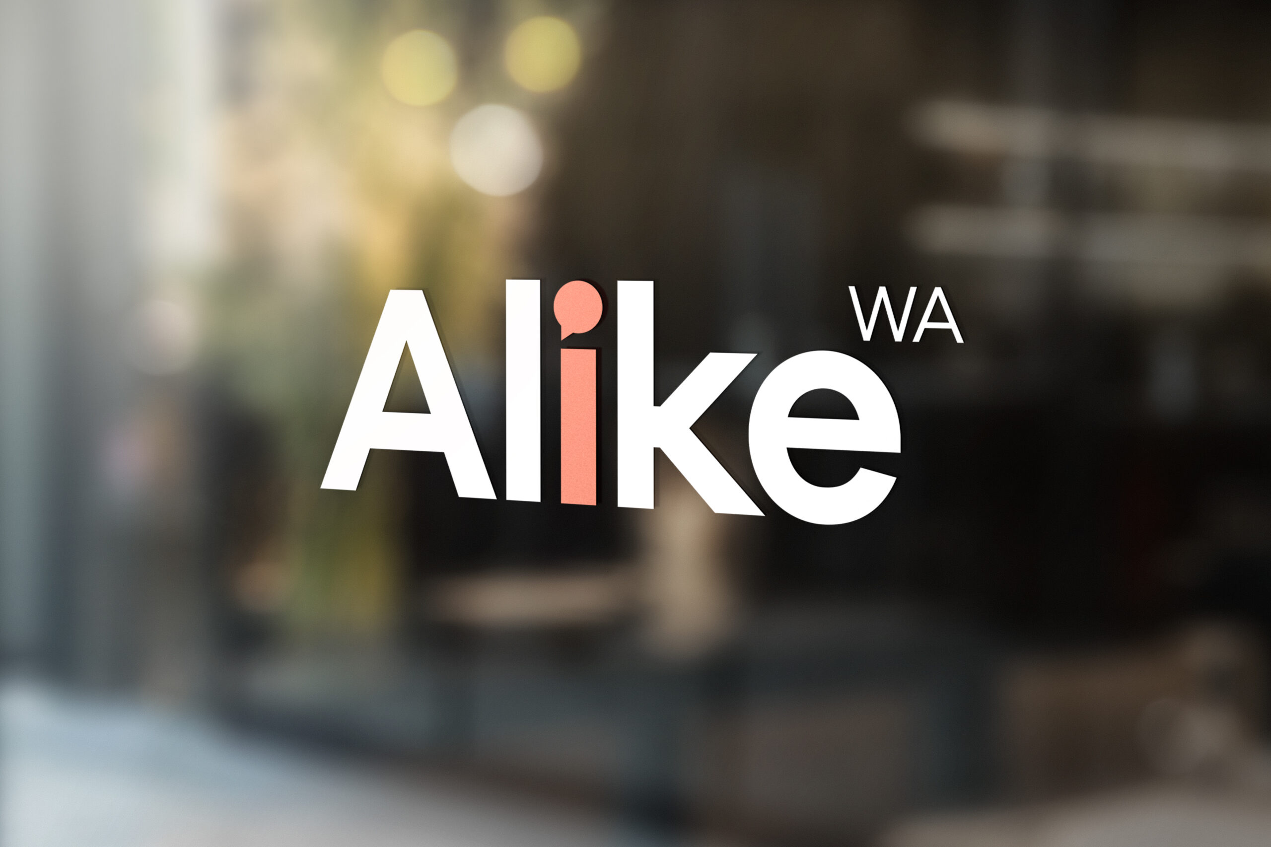
- Visual identity
Result
The new brand was launched early in 2025 to a packed venue filled with community members and stakeholders from across the sector. We knew we got it right when walking into the venue and seeing the new branding on full display and when the board chair shed tears as she expressed what the new brand meant to her.
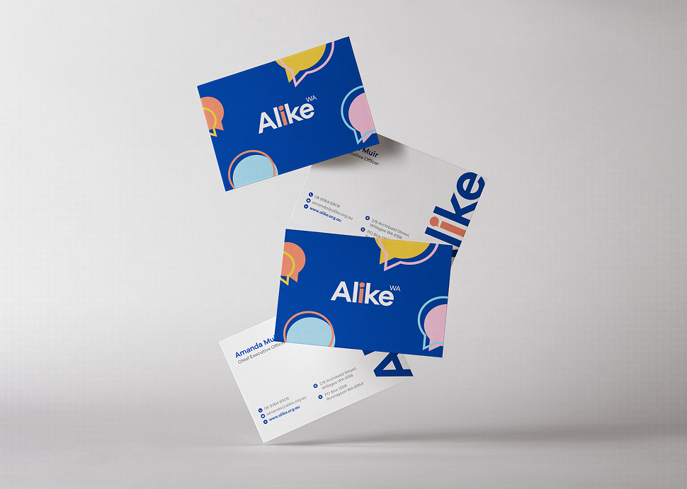
Business Cards
Mar
2025
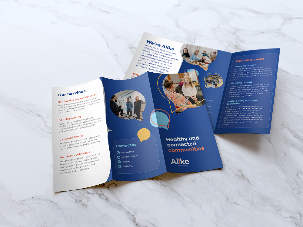
Brochure
Mar
2025
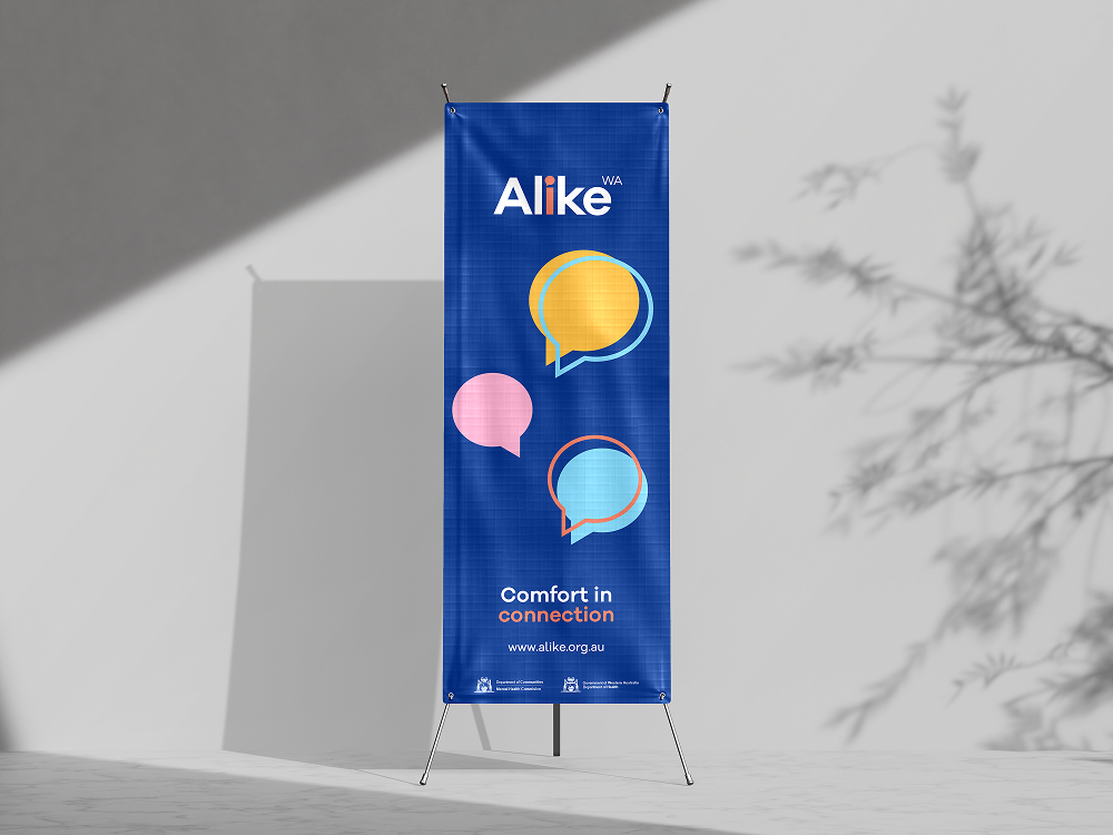
Banner
Mar
2025
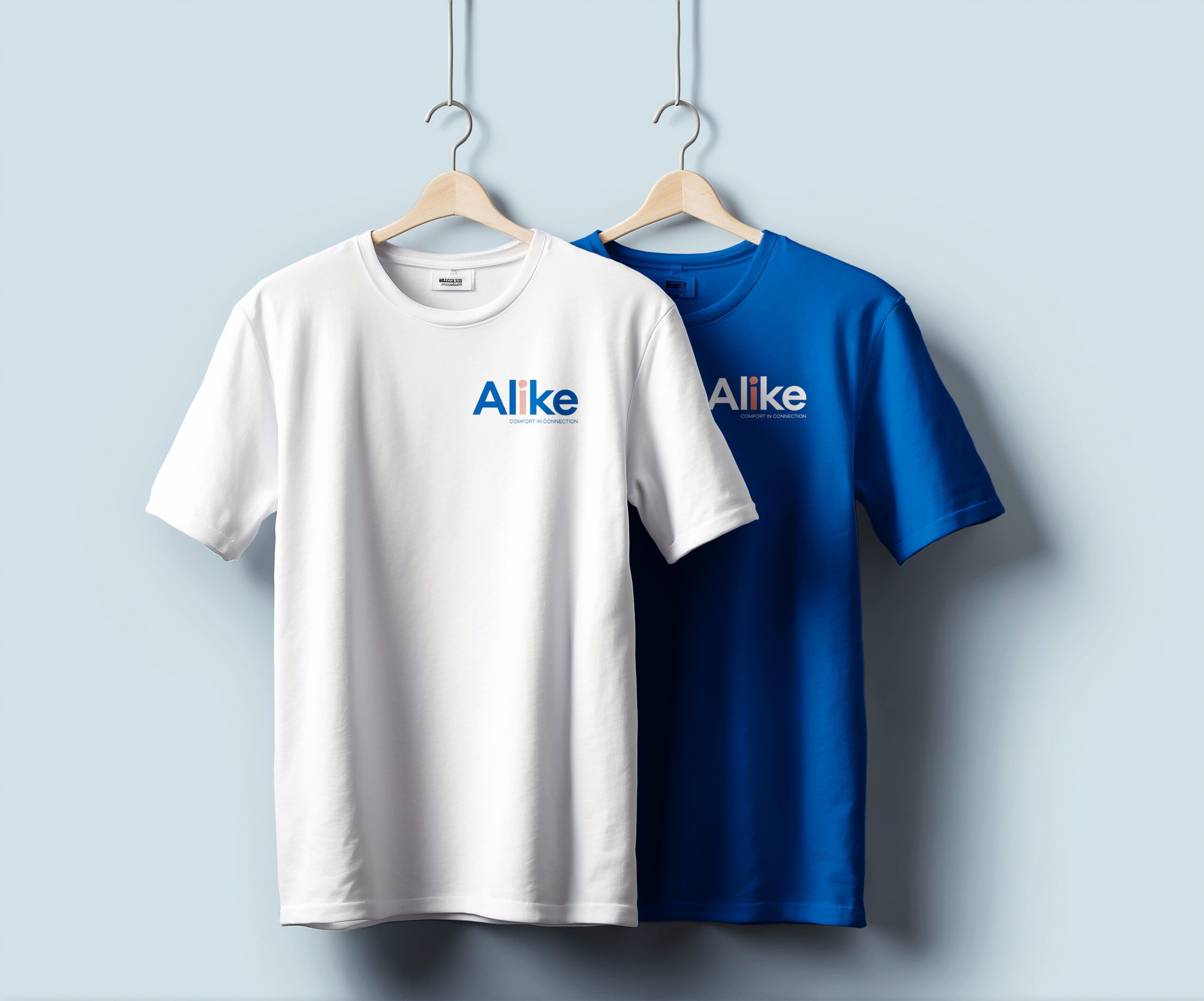
Tshirts
Mar
2025